
Vampire Records: Reviving a Drum & Bass Institution for the Modern Era
Vampire Records had a brand that was built for a different time. The logo was detailed and intricate in a way that worked when people experienced it on vinyl sleeves and flyers. But on a phone, on social media, on a website thumbnail, those details collapsed into noise.
Phil Source is not someone who needs to prove his credibility in drum & bass. As one half of Source Direct, he helped shape the sound of the genre. He’s been running Vampire Records for years, building a label with genuine heritage in the scene.
But heritage doesn’t show up on a phone screen. And when the brand, the logo, and the website are all stuck in a previous era, the reputation that took years to build starts working against you.
The Problem
Vampire Records had a brand that was built for a different time. The logo was detailed and intricate in a way that worked when people experienced it on vinyl sleeves and flyers. But on a phone, on social media, on a website thumbnail, those details collapsed into noise. It couldn’t scale down. It wasn’t legible at small sizes. It didn’t work on the platforms where people actually discover music and events in 2025.
The website had a similar problem. It wasn’t just dated in design. It wasn’t functioning properly. For a label that runs events and releases music, the website is the front door. If that front door is broken, people walk past.
This is a pattern we see constantly. A brand with real substance and a genuine track record, undermined by the way it presents itself. The people who already know Vampire Records don’t need convincing. But every new listener, every potential collaborator, every promoter considering a partnership is making a snap judgement based on what they see online. And what they were seeing didn’t match the quality of what Vampire Records actually is.
Phil needed to bring the label into the modern era. Not to chase trends. Not to abandon what made Vampire Records what it is. To make sure the brand could function where people actually encounter it, and to give the label a visual presence that matched its reputation in the scene.
The Solution
We worked with Phil over two months to rebuild Vampire Records’ brand from the ground up. The priority was clear: respect the heritage, but make everything work for how people actually experience music brands today.
Brand Identity
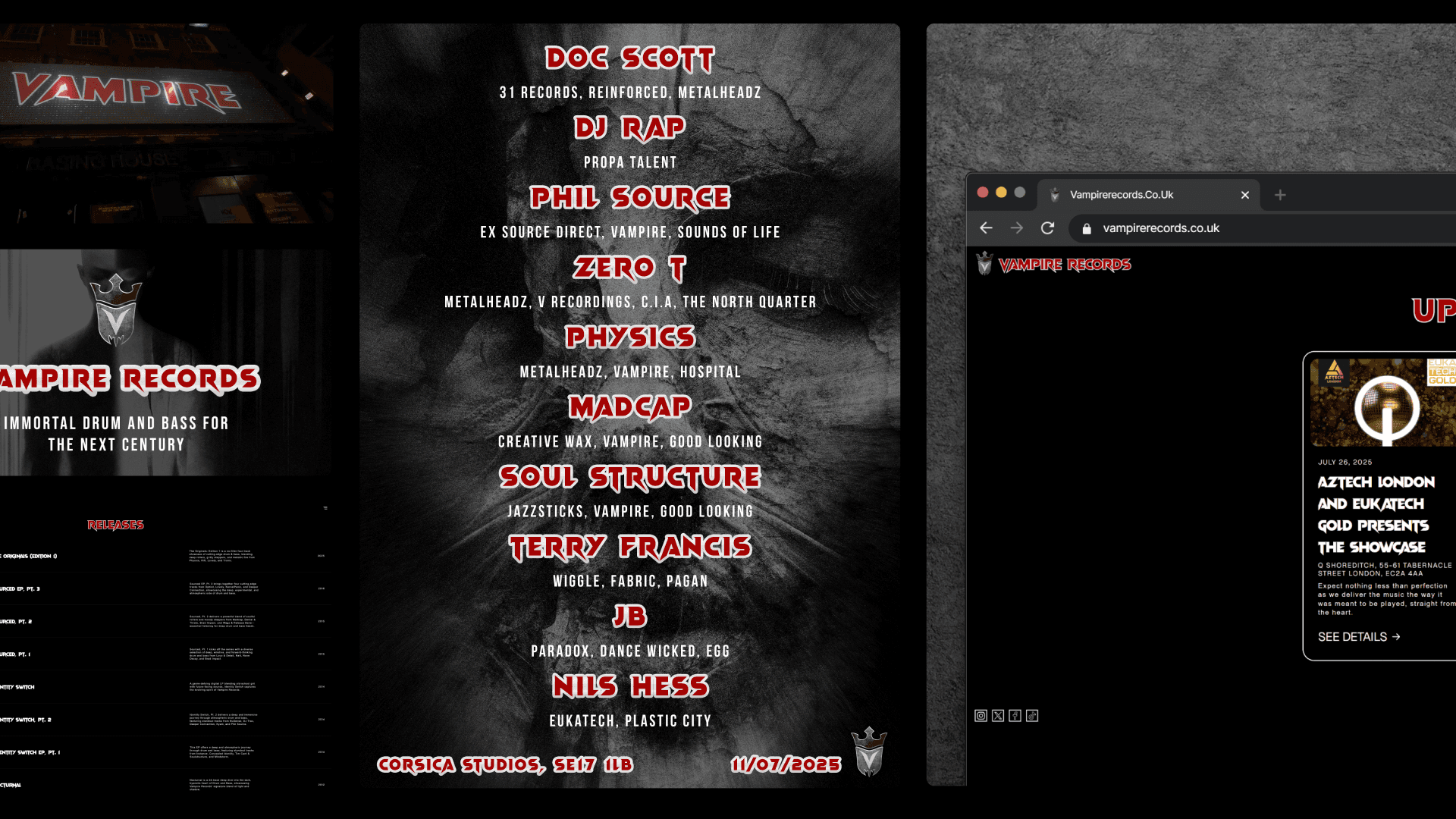
We redesigned the Vampire Records brand with modern application as the starting point. The new identity needed to hold up at every size, from a billboard to an Instagram avatar. It needed to be instantly recognisable in a social feed, legible on a mobile screen, and still carry the weight and character that a label with this history demands. The result is a brand that feels like Vampire Records, but actually works everywhere the label shows up.
Website
We built a new website from scratch. The old site was neglected and non-functional, which meant the label had no working digital home. The new site gives Vampire Records a proper platform to showcase events, releases, and the label’s story. It’s built to work across devices and gives Phil a foundation he can build on as the label grows.
Event Collateral
We designed posters and promotional material for Vampire Records’ events. In a scene where events live and die on visual presence, the collateral needed to stand out in crowded listings and social feeds while staying true to the label’s identity. Every piece was designed to be consistent with the new brand, giving the events a professional, cohesive look that matched the calibre of the artists on the lineup.
The Impact
The rebrand didn’t just change how Vampire Records looks. It changed how the label operates.
Five successful events since relaunch. The new brand and collateral system gave each event a professional, cohesive visual presence. Phil now has a design framework he can apply to every event without starting from scratch.
Industry collaborations on the horizon. Since the rebrand, Vampire Records has lined up collaborations with major names in the scene. When the brand looks credible, doors open that were previously closed. That’s the direct result of a visual identity that now matches the label’s actual standing.
A brand that finally works where it needs to. On phones, in social feeds, on event listings, on the website. The label now has a consistent, modern presence across every touchpoint where new listeners, artists, and promoters encounter it.
“Quick turnarounds, high-quality designs, genuinely understands brand vision. We’ve successfully run 5 events since the rebrand and lined up collaborations with major industry leaders.”
Phil Source, Founder, Vampire Records
Why This Matters
Vampire Records is a textbook example of what happens when a brand with real substance gets left behind by the platforms people actually use. The music was never the problem. The reputation was never the problem. The problem was that the visual identity and digital presence couldn’t keep up with where the audience had moved.
That’s The Credibility Gap in a different context. When someone discovers your label on Instagram, clicks through to your website, or sees your event poster in a feed, they’re making a judgement in seconds. If what they see doesn’t match the quality of what you actually deliver, they scroll past. No notification. No feedback. You just don’t get the follow, the ticket sale, or the collaboration enquiry.
This engagement closed that gap. It took a label with decades of credibility and gave it a brand that actually communicates that credibility to people encountering it for the first time. Five events. New collaborations with major industry figures. And a founder who can now focus on growing the label instead of fighting against a brand that wasn’t working for him.